Developing UI Library at Orka
It has been a month since I stared work in Orka, and today I basically have finished most of the pages of the OrkaUI Library Page. This article is used to record my background and motivation for developing orkaui.
Background: Increase in Project Scale, Stablized Design Specifications
Orka's previous front-end project was maintained by many people part-time, and there were no full-time experts specialized at front-end when it first started up. As a result, the code style of the developers was extremely inconsistent, including but not limited to: page margins, colors, button styles, and layouts mode. For projects with only two or three pages, this is not a problem in itself; however, with the introduction of app and hearing test pages, and the release of company's second-generation product, our front-end project needs certain specifications and more streamlined code.
Front-end developers and UI designers are not closly collaborated. In my opinion, there is a conspicuous difference between the front-end implementation and the figma design draft. In addition, each person is only responsible for maintaining the individual pages they are assigned to, resulting in UI and UX discrepancies between different pages. For example, page margins, animation duration, and how animations are being implemented.
Code reusability is low. Although not every component is very complicated, similar or identical code will appear in a large number of components. As most of our current components are based on MUI (sometimes they also use Antd), almost every component of our project will be wrapped and re-styled by different developers. However, these customized code sets are scattered in various places among every coner of the project, resulting in a situation when one person encapsulates a small component, others have no way to know what functions the component has in time, so they will choose re-implement one theirselves.
More projects. We will be launching a new website soon and will use a similar design.
Before My Works: In-Project Utils
In order to solve this problem, firstly, colleagues from the design team built their own component library on figma – in addition to the UI components, there are also icons drawn by themselves. Accordingly, the front-end team have also established a "component library" in the project. However, the component library in the website project does not perform the ability of code simplification well. It does have the ability to alleviate the problem of code irregularity in a short period of time, but in the long run, it will still make the project bloated.
My Job - Requirment Engineering, API Documents and UI Libraries
Based on this background, my work has the following goals:
- Determine the design specifications with the UI team, they ensure the coherence of the design style, and I guarantee how to implement this unified design style through the UI library.
- The margins and grid styles in different devices are specified through the Layout component - and responsive layout (with unified breakpoint) is guaranteed.
- In addition to ordinary h1, h2, etc., I added different variants of Typography according to the commonly used font styles in UI drafts. In addition, the commonly used "left-aligned on PC view, align-center on mobile view" has been defined as
textAlign: auto. - MUI's native button component does not support the function of "automatically stretch to to the width of the parent component". I refer to Antd and add the
blockattribute to orkaui's button component. orkaui/motionanimation coponent. This component can say a lot. For details, see the next part of this article.
- build a separate
@orkaui/iconslibrary- Referring to without manually import image URLs.
- Different from Antd or MUI, our icons are some kind annoying. It is not a simple icon with only one color or two colors, but more like an colorful illustration. To this end, the UI team designed slightly different versions of some icons of different sizes. As a result, I specified the commonly used icons size through
small,medium,largeand custom parameters. - In the future, our website may adopt a dark theme, and the icons use svg, which retains the possibility of re-colored. (However, the realization of this color change is still relatively complicated, as our icons are not completely separated from white and transparent, and stroke and fill will also have some inconsistencies)
- Document the design specifications and sample codes for others to refer to.
About orkaui/motion Animation Component
To Product Managers: What Can This Component Do

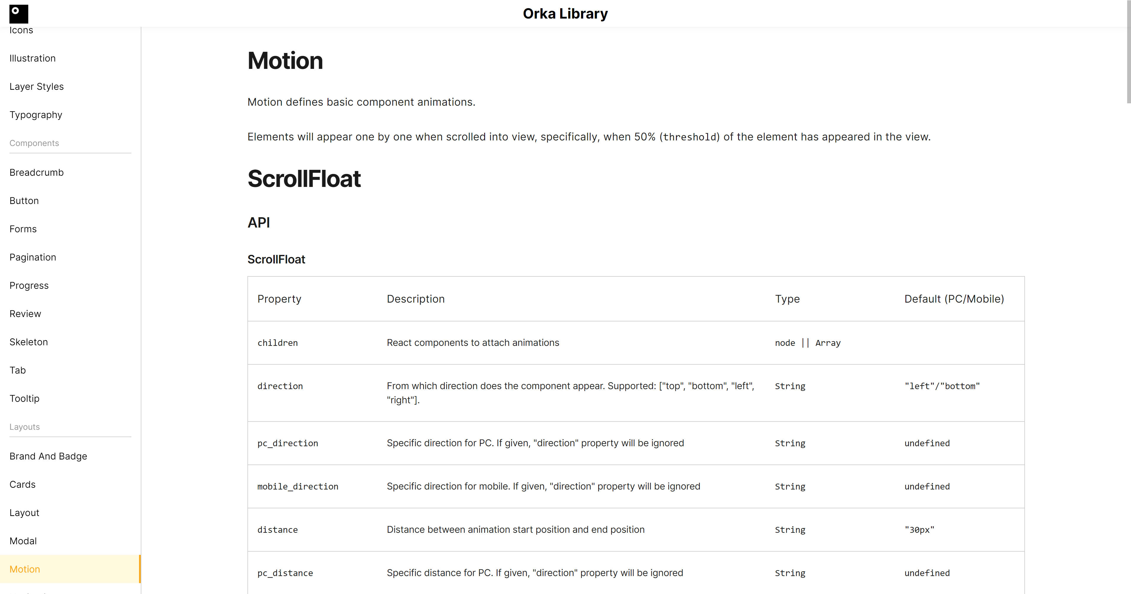
orkaui/motion is the most complicated component I've ever done. In the design process, I referred to some ideas of the Ant Motion component library QueueAnim, understood some of its design trade-offs, and added functions that our team can use.
The following is my functional comparison between orkaui/motions (orkaui) and rc-queue-anim/QueueAnim (antd):
- orkaui does better (this is why we don't use antd)
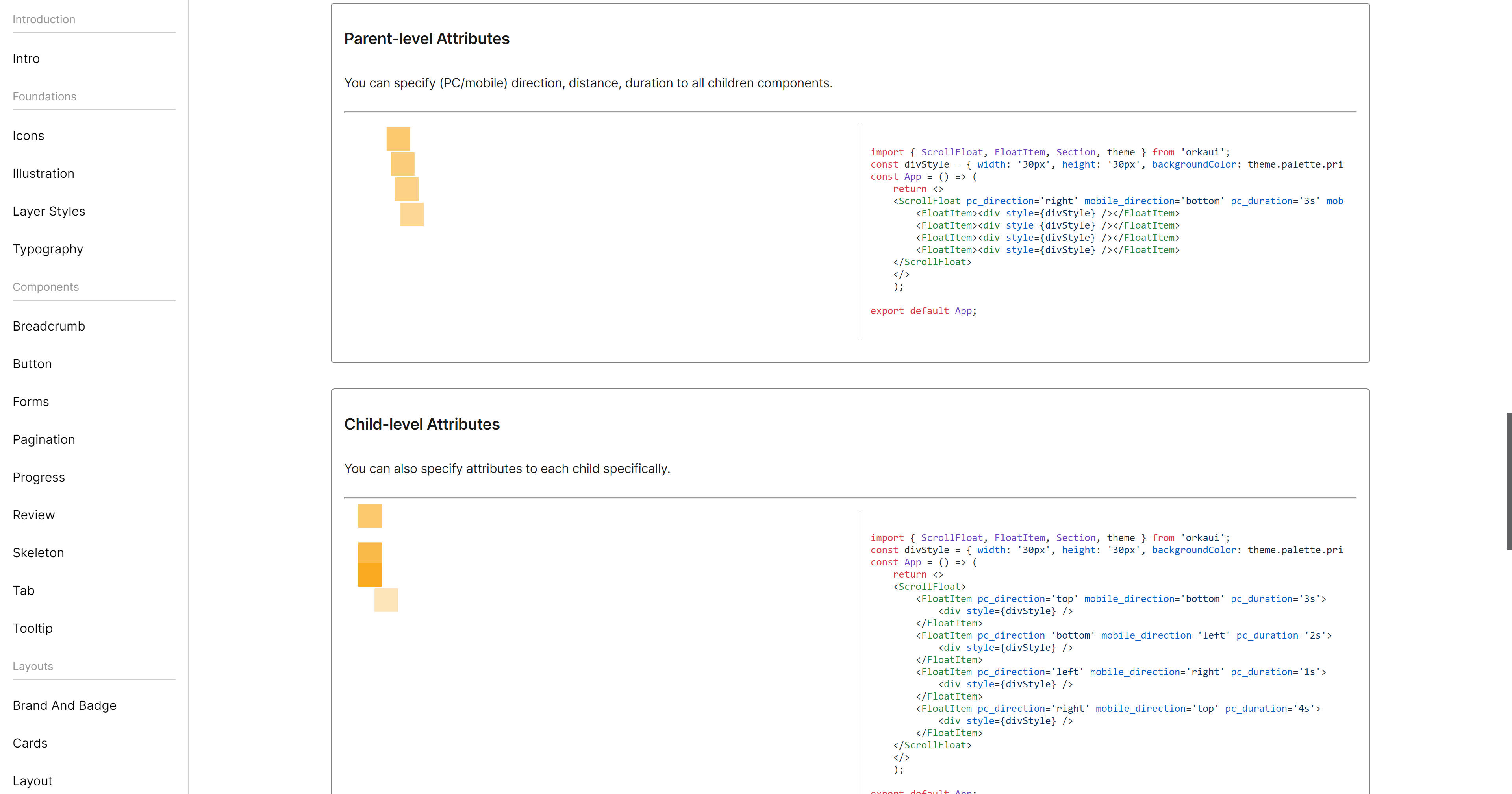
- antd only supports uniformly specifying the animation style from the parent element, and cannot specify the style for each individual child element. For orkaui, different child elements could have different styles;
- The animations of antd can only be attached to first-level sub-children of the
<QueueAnim />element. However, as our design uses grid nested layout; therefore, for orkaui, all sub-elements under the element orkaui will be iterated, sorted and animated. - antd component animation does not support PC/mobile responsive animation to achieve different animation effects; orkaui supports customization, and sets different default values for components on PC and mobile end to comply with responsive design specifications.
- Features we all support
- Animation start time, animation direction, threshold that triggers animation start, animation distance, and animation interval
- custom animation order
- More functions that antd supports (major functions)
- More animation directions and animation effects
- Animation styles are more customizable (CSS can be set)
- Support easing
- Repeat animation
For developers: how does this component work

- Under the hood: CSS transition
- Event listening and animation triggering: Use
IntersectionObserverto monitor the emergence of elements in the DOM. - Iterate root React component:
- Use React.Fragment to replace the root element
- The current element has no children or childrenplain text: return directly
- The current element is not
<FlowItem />: continue to iterate its child components - The current element is
<FlowItem />: append animation props, return with no iteration
Challenges
- Adapt components to SSR (for example, Node.js does not have
document) - How to judge that children are a specific React Component (encountered inconsistency between production and development environments:
React.node.type.nameis confused) - Compatibility: there is a problem with Safari's support for
RegExp(Safari does not support lookbehind)